Services
BRAND ENVIRONMENT DESIGN
SPACE PLANNING
The BRIEF
‘Cenzer,’ known for their Retail Lighting Solutions approached NVISAGE with a vision of an “explosive brand exhibit,” showcasing the possibilities of lighting to give one a visual experience, rather than the classic fixture & plinth design with written communication. The booth was to be in none other than the city’s premium & most recognized expo-convention in the organized Retail Industry in India.
Skills
COLLABORATION
Challenges
Visitors would be stalwarts from the Retail Industry, both Indian and International — well traveled and well informed of the nuances of brands, their behind-the-scenes strategies and their design philosophies, Wowing them would be a colossal task in itself.
TEMPORARY ART
PERMANENT IMPRESSIONS
TEMPORARY ART
PERMANENT IMPRESSIONS
APPROACH
We dabbled with several ideas before hitting upon the co-relation between ‘Light’ and ‘Colour’. One cannot exist in the absence of the other. And what better way than to present a color spectrum against a black and white background. The idea of a ‘lightbox’ spilling light was apt.
APPROACH
We dabbled with several ideas before hitting upon the co-relation between ‘Light’ and ‘Colour’. One cannot exist in the absence of the other. And what better way than to present a color spectrum against a black and white background. The idea of a ‘lightbox’ spilling light was apt.
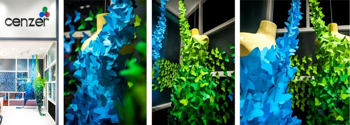
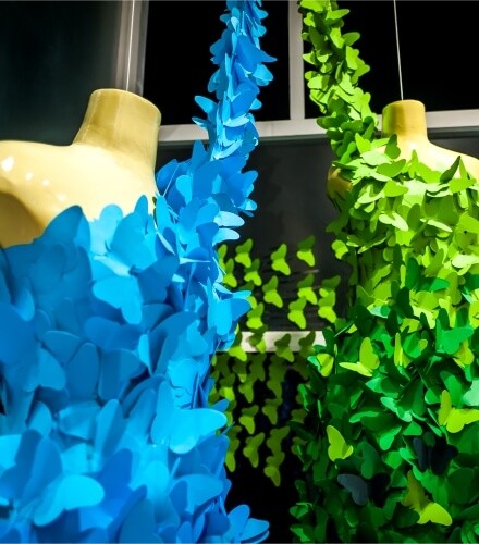
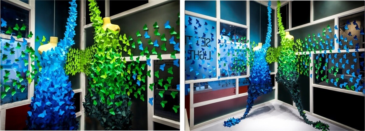
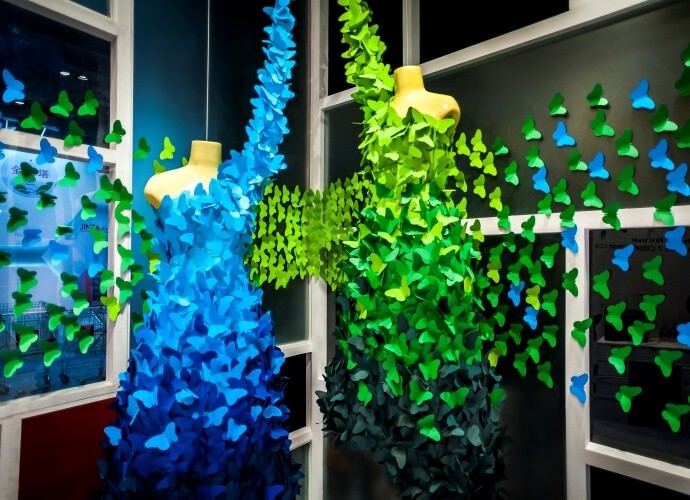
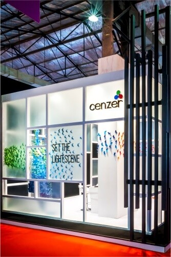
As the booth was a small six meter square, we had two strategically located entrances flanked by an art installation each. The installations were bright, yet harmonious pops of color emitting from a color wheel, The exterior was bracketed with slim black uprights, mounted with colour changing LED profile light strips. A recessed white Mondrian gridded pattern created the much needed contrast and offset the black exterior, This offered partial visibility to the colorful art installations inside, whilst maintaining a sense of closure & curiosity on the outside.
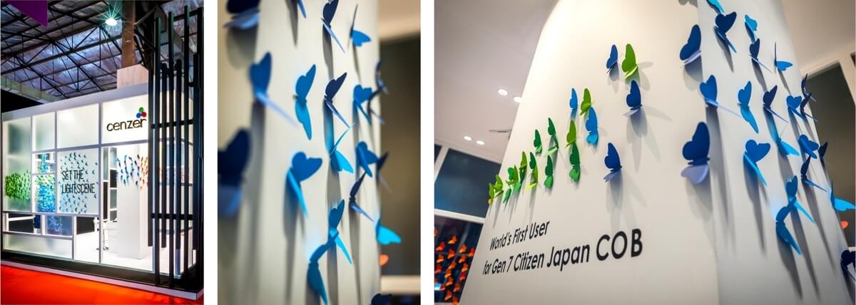
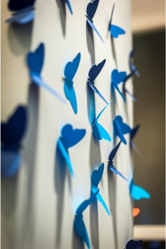
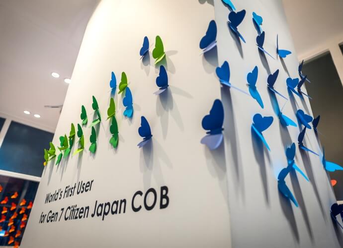
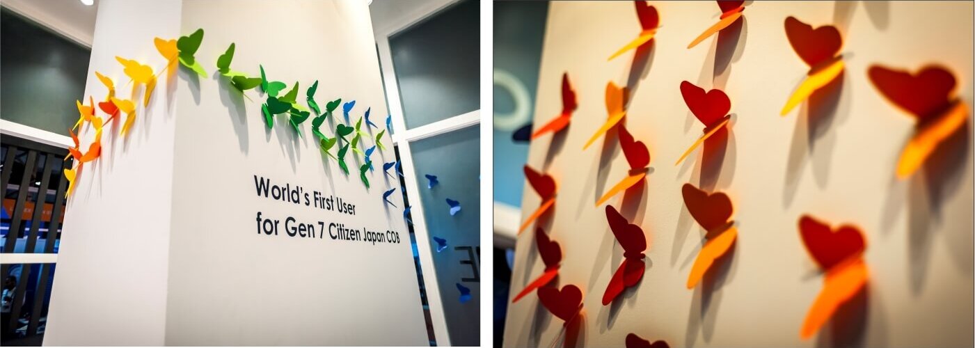
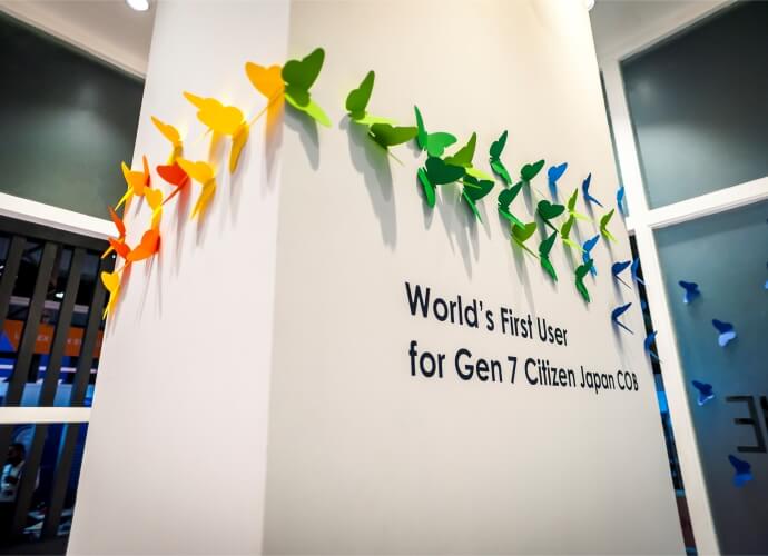
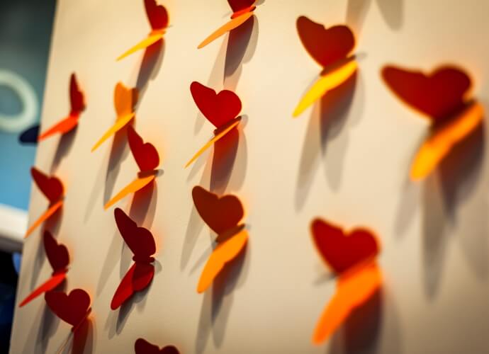
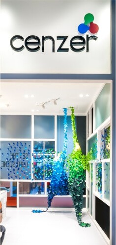
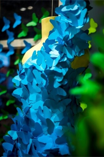
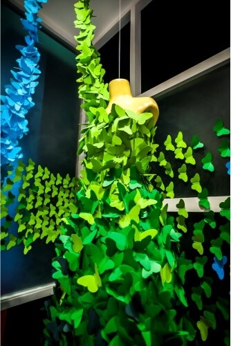
The metaphor of ‘Light’ both in terms of illumination as well as weightlessness, was further emphasized in the form of the butterfly, The material: a light, fluttery paper.
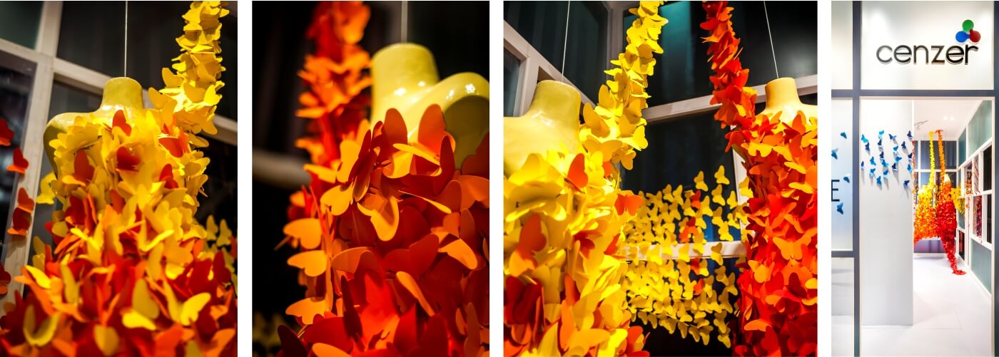
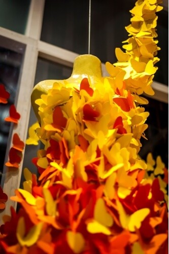
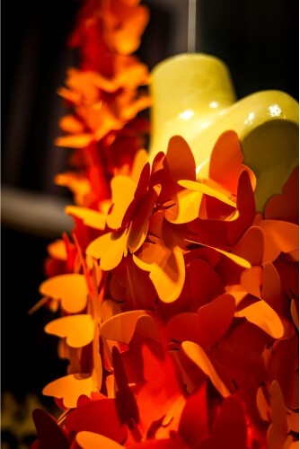
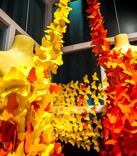
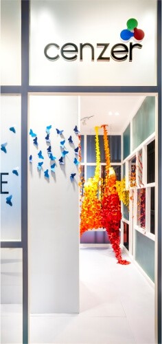
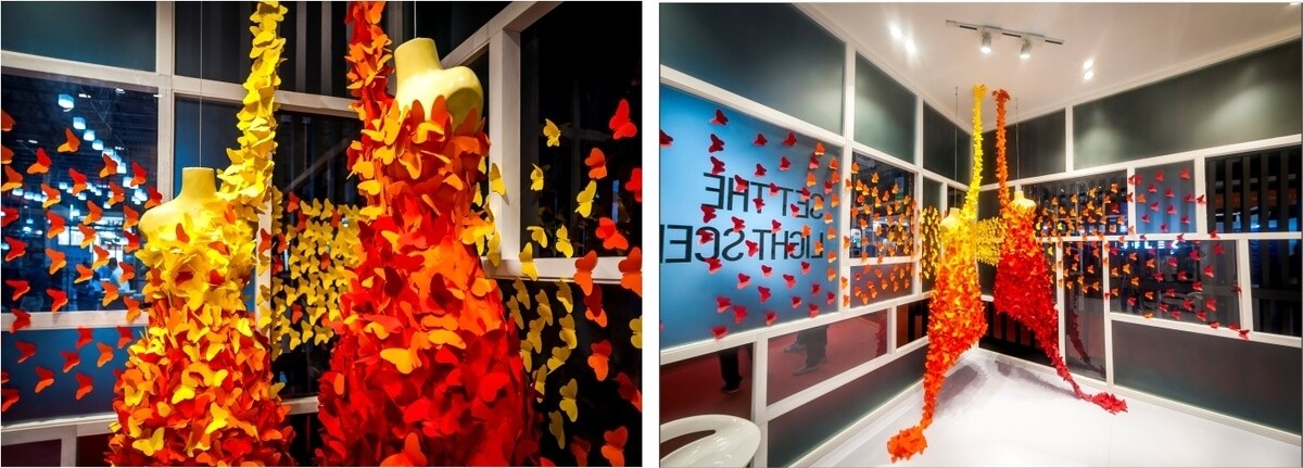
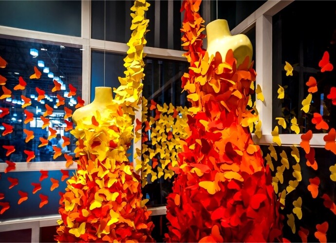
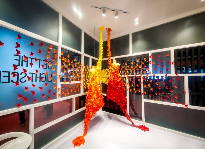
It was this kaleidoscope of a blast of butterflies that stood out amongst it’s competitors, prompting visitors to enter, with a brand experience that would be long lasting, NVISAGE delivered a promise to make it’s client stand tall above it’s competition!
