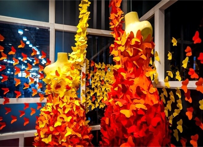
Talking about spring VM, floral representations are common mostly because they speak about colours. Womenswear including intimate wear, kids wear and fashion segments follow the floral trend largely. On the other hand, in the Men’s wear segment, promotional displays tend to have more weightage over seasonal ones.
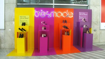
Largely, flowers are chosen for their vivid colours. But we took a different view of representing the colours for a window executed recently for footwear brand Trèsmode. As windows have taken a turn towards minimalism these days, we chose to use the sheer power of pure colours sans shapes and forms while adding meanings to their merchandise. Solid, bright colour panels were juxtaposed against each other, adding to the vibrancy. Sets of tall podiums matching the colours of the panels were positioned for the merchandises. The monotony of each colour panel was broken by adding a touch of the other juxtaposed colours. The display turned out to be sleek and simple along with being powerful, effective and promotional.


